Pandas: The Gateway to Data Exploration and Visualization
A beginner guide into the works of Pandas, an open-source data structures and analysis tool for Python
I'm a Machine Learning Engineer passionate about building production-ready ML systems for the African market. With experience in TensorFlow, Keras, and Python-based workflows, I help teams bridge the gap between machine learning research and real-world deployment—especially on resource-constrained devices. I'm also a Google Developer Expert in AI. I regularly speak at tech conferences including PyCon Africa, DevFest Kampala, DevFest Nairobi and more and also write technical articles on AI/ML here.
What is Pandas?
Not sure whether Pandas was named after the dearly beloved panda, but Pandas is a popular open-source Python library for data manipulation and analysis. The name is derived from "panel data". It offers various tools for data structures and functions in manipulating numerical data.
The library includes a DataFrame object for multivariate data manipulation and a Series object for univariate data manipulation with integrated indexing. There are various methods for data manipulation with the help of vectorization. Data set merging, joining, reshaping, and pivoting. And most importantly, tools for reading and writing data in different file formats.
So, let's dive into the workings of Pandas. For the installation of Pandas, check the official documentation here.
Importing Pandas
In your Google Colab or Jupyter Notebook, we import pandas and assign it an alias for easy reference and use throughout the notebook. The most common alias is pd.
import pandas as pd
Data Exploration
Data exploration is typically the first step of data analysis used to explore and visualize data to uncover insights from the start or identify areas or patterns to dig into more. Using interactive dashboards and point-and-click data exploration, users can better understand the bigger picture and get insights faster.
Reading Data
The beauty of Pandas is that it allows you to work with data that is stored in different file formats. As a data analyst, you need to be flexible and ready to work with all sorts of file formats thrown at you. However, the most common file format is CSV.
Reading a CSV
data = pd.read_csv('csv_file_name.csv')
Note
datais a variable that will store the file we are readingpdis the alias for Pandasread_csvis a Pandas function for reading theCSVfile
Reading a Spreadsheet
#To read an entire spreadsheet
data = pd.read_excel('spreadsheet_file_name.xlsx')
#If you wish to read a specific sheet in the spreadsheet
data = pd.read_excel('spreadsheet_file_name.xlsx', sheetname = 'sheet_name')
Reading HTML
For us to be able to explore data stored in HTML tables, we need to first ensure that the BeautifulSoup package is installed using the following command:
pip install BeautifulSoup4
Then run the following command to read data from the HTML file while importing BeautifulSoup first.
from bs4 import BeautifulSoup

data = pd.read_html('url_to_html_file')
For this article, we are going to use the "PCOS" data set. This is non-personal data for Polycystic ovary syndrome obtained from Kaggle. The data set is a CSV file.
We will check out the information about the data set to know how many entries it contains. This helps you know whether the data set has null values that need to be cleaned up.
data.info()
When you notice null values, the best way is to either drop them or fill them will data. Dropping null values helps you get accurate insights from the data during analysis and visualization.
#You can use the any() function to check for null values by Columns
pd.isnull(data).any()

# This will drop all columns that contain null values in the entire data set
data.dropna()

#This will fill the null values with the average of BMI
data['BMI'].fillna(value = data['BMI'].mean())
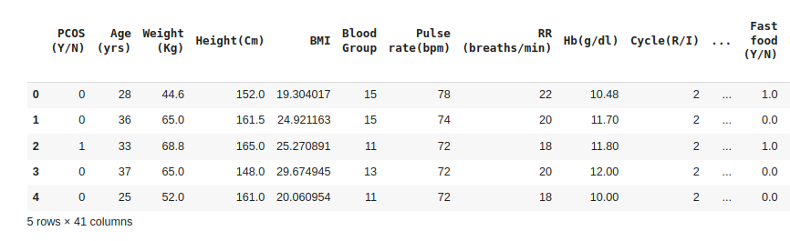
After fixing the null values, we can now go ahead and take a sneak peek at our data. The head() function enables us to display the first five (5) entries in the data set while the tail() function displays the last five (5) entries in the data set.
data.head()
Exploring the Data
The GroupBy function
Looking at our data, we can group the data by PCOS to see which age is affected most and count the number of those with PCOS for each age.
groupbyPcos = data.groupby('Age (yrs)').count()
groupbyPcos.columns = ['Number of PCOS Cases']
groupbyPcos
The sum() funtion
The data set we are dealing with has data on age, height, BMI, etc. and we can sum up this data
groupbyPcos = data.groupby('BMI').sum()
Data Visualization
Data visualization allows users to explore and analyze data quickly and easily. This is good to get visual insights on patterns that you are like to have in your model.
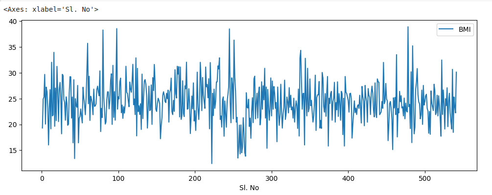
Line Plot
A line plot is a basic plot that shows the trend of data over time. In Pandas, you can create a line plot using the plot() function. To visualize a simple line plot of the data we have, we run the following code:
#Line Plot of Sl. No against BMI
data.plot(x="Sl. No", y="BMI", figsize=(12,4))
Bar Plot
A bar plot is a plot that shows the distribution of data in different categories. In Pandas, you can create a bar plot using the plot.bar() function. To visualize a bar plot of the data, we run the following code:
data.plot.bar(x="Sl. No", y="BMI", figsize=(12,4))
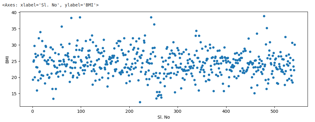
Scatter Plot
A scatter plot is a plot that shows the relationship between two variables. In Pandas, you can create a scatter plot using the plot.scatter() function. To visualize a scatter plot of the data, we run the following code:
data.plot.scatter(x="Sl. No", y="BMI", figsize=(12,4))
Box Plot
A box plot is a plot that shows the distribution of data using quartiles. In Pandas, you can create a box plot using the plot.box() function. To visualize a box plot of the data, we run the following code:
data.plot.box(x="Sl. No", y="BMI", figsize=(12,4))
Conclusion
In conclusion, Pandas is a very powerful library used to manipulate data and visualize it for analysis. It offers a wide range of functions to enable a user to play around with their data and make sense of it.
PS: Access the dataset used here. (License: MIT License)