Data Visualization with Matplotlib and Seaborn
A beginner guide to data visualization in Python using Matplotlib and Seaborn libraries

I'm a Machine Learning Engineer passionate about building production-ready ML systems for the African market. With experience in TensorFlow, Keras, and Python-based workflows, I help teams bridge the gap between machine learning research and real-world deployment—especially on resource-constrained devices. I'm also a Google Developer Expert in AI. I regularly speak at tech conferences including PyCon Africa, DevFest Kampala, DevFest Nairobi and more and also write technical articles on AI/ML here.
Introduction
Data visualization is a crucial step in the data analysis process. It allows us to visually explore and communicate data patterns, trends, and relationships effectively. Matplotlib and Seaborn are two popular Python libraries that provide powerful tools for creating a wide range of static, animated, and interactive visualizations.
Matplotlib
Matplotlib is a versatile plotting library that offers a high degree of control over plot customization. It provides a wide variety of plot types, including line plots, scatter plots, bar plots, histograms, and more. Matplotlib can be used in interactive environments like Jupyter or Google Colab notebooks.
Seaborn
Seaborn is a higher-level data visualization library built on top of Matplotlib. It simplifies the process of creating attractive statistical graphics by providing high-level functions for common plot types. Seaborn also offers themes and color palettes that make plots visually appealing with minimal customization.
Installation
Before we start, let's make sure Matplotlib and Seaborn are installed. You can install them using pip, the Python package installer, by running the following commands in your terminal:
pip install matplotlib
pip install seaborn
Make sure you have an up-to-date version of both libraries. Now that we have everything set up, let's dive into the tutorial!
Visualization with Matplotlib
Line Plot
A line plot is a basic plot type that displays data points connected by lines. It is useful for visualizing trends and changes over time or any continuous variable. Here's an example of creating a simple line plot using Matplotlib:
import matplotlib.pyplot as plt

# Sample data
listOne = [1, 2, 3, 4, 5]
listTwo = [2, 4, 6, 8, 10]

# Create a line plot
plt.plot(listOne, listTwo)

# Add labels and title
plt.xlabel('X-axis')
plt.ylabel('Y-axis')
plt.title('Line Plot of Two Lists')

# Show the plot
plt.show()
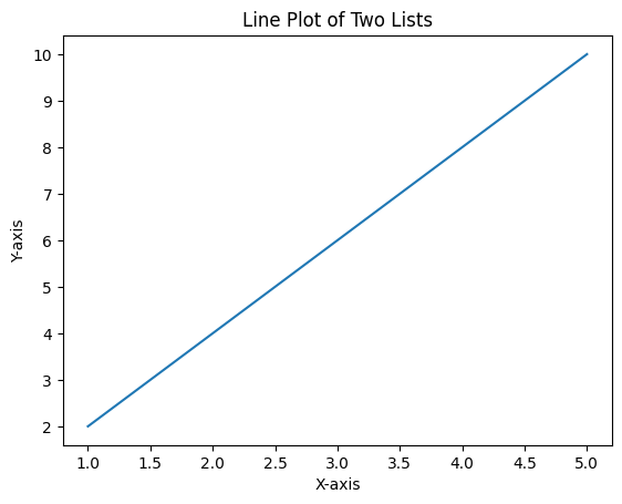
We import matplotlib.pyplot as plt, create lists listOne and listTwo representing the data points, and then use the plot() function to create the line plot. We add labels to the x-axis and y-axis and provide a title for the plot. Finally, we use show() to display the plot.
Scatter Plot
A scatter plot displays individual data points as markers on a two-dimensional plane. It is useful for examining the relationship between two continuous variables. Let's create a scatter plot using Matplotlib:
import matplotlib.pyplot as plt

# Sample data
listOne = [1, 2, 3, 4, 5]
listTwo = [2, 4, 6, 8, 10]

# Create a scatter plot
plt.scatter(listOne, listTwo)

# Add labels and title
plt.xlabel('X-axis')
plt.ylabel('Y-axis')
plt.title('Scatter Plot of Two Lists')

# Show the plot
plt.show()

We use the scatter() function to create a scatter plot. The rest of the code is similar to the line plot example.
Bar Plot
A bar plot represents data as rectangular bars, with the length of each bar proportional to the value it represents. Bar plots are commonly used to compare categorical data or to show the distribution of a continuous variable across categories. Here's an example of creating a bar plot using Matplotlib:
import matplotlib.pyplot as plt

# Sample data
categories = ['A', 'B', 'C', 'D']
values = [10, 15, 7, 12]

# Create a bar plot
plt.bar(categories, values)

# Add labels and title
plt.xlabel('Categories')
plt.ylabel('Values')
plt.title('Bar Plot of Categories and Values')

# Show the plot
plt.show()
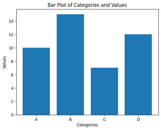
We use the bar() function to create a bar plot. The categories list represents the x-axis categories, and the values list represents the height of each bar. We add labels to the x-axis and y-axis and provide a title for the plot. Finally, we use show() to display the plot.
Histogram
A histogram is used to visualize the distribution of a single continuous variable. It divides the range of values into intervals called bins and displays the frequency or proportion of values falling into each bin. Here's an example of creating a histogram using Matplotlib:
import matplotlib.pyplot as plt
import numpy as np

# Generate random data
np.random.seed(42)
data = np.random.normal(0, 1, 1000)

# Create a histogram
plt.hist(data, bins=30)

# Add labels and title
plt.xlabel('Values')
plt.ylabel('Frequency')
plt.title('Histogram Showing Values against Frequency')

# Show the plot
plt.show()

Here we use the hist() function to create a histogram. The data variable contains random values generated using NumPy's random.normal() function. We specify the number of bins using the bins parameter. We add labels to the x-axis and y-axis and provide a title for the plot. Finally, we use show() to display the plot.
Visualization with Seaborn
Box Plot
A box plot, also known as a box-and-whisker plot, is used to display the distribution of a continuous variable across different categories or groups. It shows the median, quartiles, and any potential outliers in the data. Let's create a box plot using Seaborn:
import seaborn as sns
import numpy as np
import pandas as pd

# Generate random data
np.random.seed(42)
dataOne = np.random.normal(0, 1, 100)
dataTwo = np.random.normal(2, 1, 100)
dataThree = np.random.normal(1, 2, 100)

# Combine the data into a DataFrame
data = np.concatenate([dataOne, dataTwo, dataThree])
categories = np.repeat(['A', 'B', 'C'], 100)
df = pd.DataFrame({'Category': categories, 'Data': data})

# Create a box plot
sns.boxplot(x='Category', y='Data', data=df)

# Add title
plt.title('Box Plot of Data against Category')

# Show the plot
plt.show()
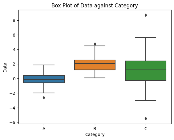
We use the boxplot() function from Seaborn to create a box plot. We create three sets of random data, dataOne, dataTwo, and dataThree, representing different categories. We then combine the data into a DataFrame, df, with the 'Category' and 'Data' columns. Finally, we use boxplot() by specifying the x-axis as 'Category', the y-axis as 'Data', and the DataFrame df. We add a title to the plot and display it using show().
Heatmap
A heatmap is a graphical representation of data where the values in a matrix are represented as colors. It is useful for visualizing the relationships or patterns in large datasets. Let's create a heatmap using Seaborn:
import seaborn as sns
import numpy as np

# Generate random correlation data
np.random.seed(42)
data = np.random.rand(10, 10)
corr = np.corrcoef(data)

# Create a heatmap
sns.heatmap(corr, annot=True, cmap='coolwarm')

# Add title
plt.title('Heatmap of the Data and the Correlation')

# Show the plot
plt.show()
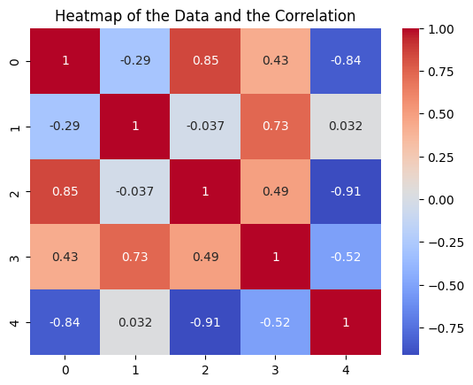
We use the heatmap() function from Seaborn to create a heatmap. We generate random data data and calculate the correlation matrix corr using NumPy's corrcoef() function. We then pass corr to heatmap(), set annot=True to display the correlation values on the heatmap, and specify the color map as 'coolwarm'. We add a title to the plot and display it using show().
Additional Customizations
Both Matplotlib and Seaborn offer a wide range of customization options to enhance your plots. Here are a few additional customization techniques:
Axis Limits and Ticks
You can set custom axis limits using xlim() and ylim() functions in Matplotlib:
plt.xlim(0, 10)
plt.ylim(0, 20)
You can also customize the ticks on the axis using xticks() and yticks():
plt.xticks([0, 1, 2, 3, 4, 5])
plt.yticks([0, 5, 10, 15, 20])
Legends
You can add legends to your plots to provide additional information about the data using legend():
plt.plot(x, y, label='Line 1')
plt.plot(x, z, label='Line 2')
plt.legend()
Color Maps
Both Matplotlib and Seaborn provide a variety of color maps for different purposes. You can specify the color map using the cmap parameter. For example, in a scatter plot:
plt.scatter(x, y, cmap='viridis')
Styling with Seaborn
Seaborn provides additional styling options using its built-in themes. You can set a different theme using set_theme(). For example:
sns.set_theme(style='whitegrid')
Seaborn also provides various color palettes that you can use to customize the colors in your plots. You can set a different color palette using set_palette(). For example:
sns.set_palette('Set2')
Conclusion
We have covered the basics of data visualization using Matplotlib and Seaborn. We explored various plot types, including line plots, scatter plots, bar plots, histograms, box plots, and heatmaps. We also discussed additional customization techniques to enhance your plots. With these tools and techniques, you can create visually appealing and informative visualizations to explore and communicate your data effectively.